4 reasons your customers want you to use video
Some excellent reasons here from Vidyard why you should use videos.

Some excellent reasons here from Vidyard why you should use videos.


Amelie and Friends Mobile Friendly Website by Blue Gekko
There’s a fantastic restaurant down in Chichester, Amelie and Friends. The Sunday Telegraph lists it in its Top 500 Restaurants in Great Britain and Ireland, and it has been awarded the coveted Bib Gourmand in the 2014 Michelin Guide.
And it now has a brand-new mobile friendly website to complement its existing desktop version.
The main features of a mobile friendly website are
This is important for any business now, as a third or more of your website traffic will be on a mobile phone. But it is particularly important for restaurants because
So if you’re looking for somewhere to eat in Sussex go to Amelie and Friends’ new mobile website. You’ll find it really easy to phone them up to book a table; and the navigation icon will show you the way to get there.

 There were three aims with this website
The first aim was a given. All new Blue Gekko websites are responsive now. That means they configure according to the device they are being viewed from. That means that whether they are being viewed on a laptop, a tablet or a mobile phone they will be quick to load, easy to read and easy to navigate
To achieve the showcase the main focus of the site is the two gallery pages – one for wedding cakes, the second for other celebrations – which display the cake images so well. The cakes are all on display on the page, but click on one of the images and a sumptious slideshow starts.
 To achieve the third aim – make it easy to get in touch – the contact phone number is available throughout the site, and a big link to the contact us page is at the foot of all other pages.
But there’s also a bit of magic that only a responsive website can bring. On mobile phone there’s a “Tap To Call” button. That means that a mobile visitor just needs to do a couple of taps with their thumb and The Hull Cake’s phone is ringing. If you resize your browser on your laptop narrower and narrower – when it gets smaller than it would be on a tablet you can see the Tap To Call button appear out of nowhere.
Magic? Not really, but the magic happens when your visitors go “Tap Tap Call” – because you’ve got a customer.

 I was looking at Google analytics for a bunch of client accounts, and was struck by how consistently mobile browsing is now at least 30% of all website traffic. I’ve picked out 3 examples from different industries just to illustrate this point.
The message from these pies is that if you are hungry for business you have to look after your mobile visitor. Even B2B companies will benefit from making their sites easy to read and navigate on a phone, with a clear call to action (usually a “Tap To Call” button).
 The takeaway (sorry for the pun) for restaurants from this is you HAVE to make your site mobile friendly. Not only are most of your website visitors on a phone, but mobile visitors are far more likely to want to eat within an hour.
A couple of questions for you:
If the answer to either of these is “I don’t know”, you need to get in touch.
 From top to bottom: a B2B business; an entertainment business; a restaurant
Blue = desktop/laptop views
Green = mobile views
Orange = tablet views
 It has been a pleasure working on a new website for Cornucopia Festival (26 – 28 September at Burton Constable if you’re interested). The key aims with this site were
A further consideration, which is vital for any website these days, was that it must look great, be quick to load, easy to read and easy to navigate on a phone. All Blue Gekko websites are “responsive” now. This means they arrange themselves well on any device. Try it out – look at Cornucopia Festival on your phone. Did I mention the Festival is being held over the weekend of 26 – 28 September at Burton Constable? And you can get your tickets online? The other great feature of doing this site is my free ticket 🙂 See you there!
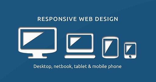

Blue Gekko Responsive Web Design
I’ve just come across this article at Econsultancy*, which shows the huge ROIs being achieved by companies changing to mobile friendly websites. 19%, 51% even 100% increases in conversion rates have been achieved by the 14 companies given as examples.
“It’s pretty straightforward to make a business case for mobile-friendly design if you have a transactional but non-responsive website: simply look at your conversion rates by device. They’ll probably be fairly woeful for tablets, and even worse for mobiles (certainly if ours are anything to go by). Add a dollop of simple maths and you’ll have some idea of the opportunity cost of not making the customer experience better for mobile and tablet users.”
It’s not surprising – now half of internet use is on a mobile device; and especially if you are in a Business to Consumer area you may well find 20% or so of your customers not using a desktop to view your website at all. So we’ve passed the point of mobile-friendly websites being something to think about in the future. If you don’t act now, it is costing your business. And if you would like to improve your website’s effectiveness by 19%, 51% or even 100% get in touch. 01482 861161 or use the form here * Go and read the whole article to see the 14 brands that increased conversion rates via responsive design Mobile Friendly Website Image by Muhammad Rafizeldi