
by Ben | May 7, 2014 | Handmade Websites, Mobile Friendly Websites
 There were three aims with this website
- To make it display well and be easy to use for visitors on a mobile site.
- To showcase the many, many examples of stunning, beautifully made cakes The Hull Cake had provided for its very spoiled clients
- To make it easy for a potential customer to get in touch
The first aim was a given. All new Blue Gekko websites are responsive now. That means they configure according to the device they are being viewed from. That means that whether they are being viewed on a laptop, a tablet or a mobile phone they will be quick to load, easy to read and easy to navigate
To achieve the showcase the main focus of the site is the two gallery pages – one for wedding cakes, the second for other celebrations – which display the cake images so well. The cakes are all on display on the page, but click on one of the images and a sumptious slideshow starts.
 To achieve the third aim – make it easy to get in touch – the contact phone number is available throughout the site, and a big link to the contact us page is at the foot of all other pages.
But there’s also a bit of magic that only a responsive website can bring. On mobile phone there’s a “Tap To Call” button. That means that a mobile visitor just needs to do a couple of taps with their thumb and The Hull Cake’s phone is ringing. If you resize your browser on your laptop narrower and narrower – when it gets smaller than it would be on a tablet you can see the Tap To Call button appear out of nowhere.
Magic? Not really, but the magic happens when your visitors go “Tap Tap Call” – because you’ve got a customer.

by Ben | May 5, 2014 | Mobile Friendly Websites
 I was looking at Google analytics for a bunch of client accounts, and was struck by how consistently mobile browsing is now at least 30% of all website traffic. I’ve picked out 3 examples from different industries just to illustrate this point.
The message from these pies is that if you are hungry for business you have to look after your mobile visitor. Even B2B companies will benefit from making their sites easy to read and navigate on a phone, with a clear call to action (usually a “Tap To Call” button).
 The takeaway (sorry for the pun) for restaurants from this is you HAVE to make your site mobile friendly. Not only are most of your website visitors on a phone, but mobile visitors are far more likely to want to eat within an hour.
A couple of questions for you:
- What do your website stats tell you about your visitor make-up?
- What are you doing to give your mobile visitors a good experience?
If the answer to either of these is “I don’t know”, you need to get in touch.
 From top to bottom: a B2B business; an entertainment business; a restaurant
Blue = desktop/laptop views
Green = mobile views
Orange = tablet views

by Ben | Apr 30, 2014 | Wordpress Updates
Hi Larry
 Or is it Gabriel? Or Laura?? You seem to use a few different names. Anyway, your IP address says you’re in Ukraine so I’m guessing none of these names is real.
Thanks for showing an interest in one of my client’s sites, but I’m afraid I’m going to have to disappoint you. No, you cannot log in.
And you will have noticed that after your 20th attempt you are permanently excluded, so you’re going to have to try your luck elsewhere.
Not-so-very-kind Regards
Ben
The message for everyone else is – how secure is your site?
Spammers around the world have bots churning away at lightning speed till they get passwords right. Then, when they get in, you are stuffed – they can then lock you out!
You remember your host promising something about backups – will they be able to set every thing back to normal? Even if they can, that process can be a real pain, and you hope with all your fingers crossed that your website visitors haven’t been affected by any dodgy links that Larry and his pals have inserted.
It’s the stuff of nightmares.
As you will guess, Blue Gekko sites have strong passwords and log in fails are locked out after 20 attempts. If you’d like to know how to tighten up the security on your WordPress site, get in touch.
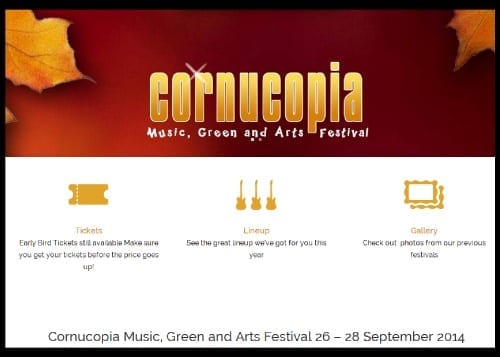
by Ben | Apr 29, 2014 | Handmade Websites, Mobile Friendly Websites
 It has been a pleasure working on a new website for Cornucopia Festival (26 – 28 September at Burton Constable if you’re interested). The key aims with this site were
- to develop an easy to navigate site…
- that provides full information about the Festival
- that whets the appetite for the event with information and videos of the artists (which include Big Country, The Animals and Friends and Henry Priestman)
- that makes it easy for visitors to buy tickets
- and which conveys the spirit of Autumn
A further consideration, which is vital for any website these days, was that it must look great, be quick to load, easy to read and easy to navigate on a phone. All Blue Gekko websites are “responsive” now. This means they arrange themselves well on any device. Try it out – look at Cornucopia Festival on your phone. Did I mention the Festival is being held over the weekend of 26 – 28 September at Burton Constable? And you can get your tickets online? The other great feature of doing this site is my free ticket 🙂 See you there!
by Ben | Apr 1, 2014 | Mobile Friendly Websites

Blue Gekko Responsive Web Design
I’ve just come across this article at Econsultancy*, which shows the huge ROIs being achieved by companies changing to mobile friendly websites. 19%, 51% even 100% increases in conversion rates have been achieved by the 14 companies given as examples.
“It’s pretty straightforward to make a business case for mobile-friendly design if you have a transactional but non-responsive website: simply look at your conversion rates by device. They’ll probably be fairly woeful for tablets, and even worse for mobiles (certainly if ours are anything to go by). Add a dollop of simple maths and you’ll have some idea of the opportunity cost of not making the customer experience better for mobile and tablet users.”
It’s not surprising – now half of internet use is on a mobile device; and especially if you are in a Business to Consumer area you may well find 20% or so of your customers not using a desktop to view your website at all. So we’ve passed the point of mobile-friendly websites being something to think about in the future. If you don’t act now, it is costing your business. And if you would like to improve your website’s effectiveness by 19%, 51% or even 100% get in touch. 01482 861161 or use the form here * Go and read the whole article to see the 14 brands that increased conversion rates via responsive design Mobile Friendly Website Image by Muhammad Rafizeldi